Brand identity for Europe's first Venture Debt Firm. Designed for Founders.
- Logo
- Colors
- Fonts
- Styleguide
UX & UI Design
- Landing Page
- Website
- Investor Dashboard
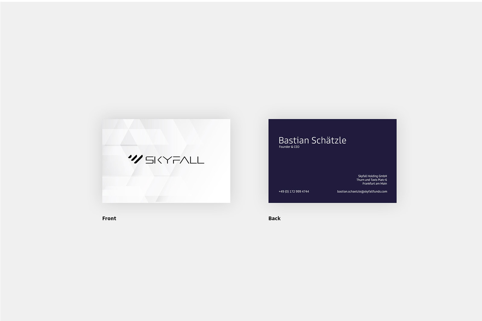
Stationary
Flyer
Onepager
Flyer
Onepager
Year
untill Today
Sleek and modern, the symbol is formed of three shapes: the forward slash is representative of growth a the financed startup, b sky fall itself and c stands for growing ETFs. The combination represents the rainfall which stands in German for „warmer regen“ which means a positive financial boost for startups.
Colors & Material
Skyfall Deep Dark
#007eff
Skyfall Deep Purple
#c62a41
Skyfall Purple
#333437
Typography
Primary: Goldman Sans
A B C D E F G H I J K L M N O P Q R S T U V W X Y Z
a b c d e f g h i j k l m n o p q r s t u v w x y z
Secondary: Times New Roman
A B C D E F G H I J K L M N O P Q R S T U V W X Y Z
a b c d e f g h i j k l m n o p q r s t u v w x y z
What‘s Delivered
Branding to Content Creation at it‘s best.

